The public accessibility specification template created through my work in this case study may be found in ServiceNow’s Figma Community.
Improving an Accessibility Specification Template
Note: ServiceNow internal assets are confidential. As such, artifacts presented in my case study here are facsimiles of the materials used in this effort, using public-facing ServiceNow assets for illustrative purposes.
Background
In the Experience Organization at ServiceNow (EX), accessibility has become a core area of focus, particularly for the Now Design System. Within the design system there are over 50 web components that may be used atomically, or as part of more complex macro-components. Internally, we use Figma to build the specifications for each component, from its visual presentation, interactions and other behaviors, and a section for accessibility information.
There was a recognized need for the development of a new template for designers to annotate accessibility information for components, one that could be consumed by engineers, quality testers, and any other function that needed to reference a component’s accessibility specifications.
Methodology
My approach to this design challenge was qualitative, as the diverse perspectives within EX at ServiceNow would offer the insights that were most specific to our company.
Process
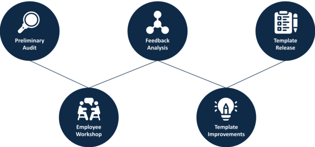
- Preliminary Audit
- Workshop with Cross-Section of Employees
- Findings
- Template Design Improvements
- Release
Participants
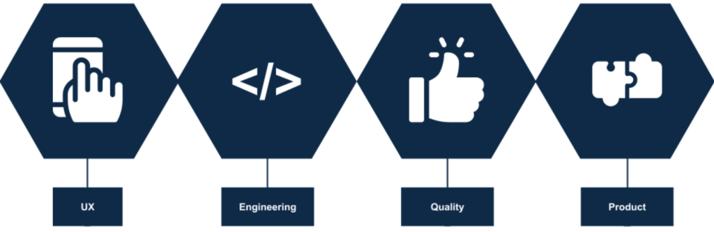
Employees from several domains participated in the workshop.
- UX Design
- Software Engineering
- Quality Engineering
- Product Management
Preliminary Audit
The existing format for the accessibility section was barebones, with a single keyboard interaction section and a section to document color contrast values for various combinations of adjacent colors used in the component. This was not comprehensive enough for designers to capture all the potential accessibility information needed for software developers to build the component accessibly, nor for QA testers to verify its accessibility once built.
Workshop
I organized a workshop that brought together representatives from designer, engineering, and QE for a collaborative exploration of the current template’s strengths and weaknesses. The workshop was conducted on Zoom, with Miro used as a collaborative space for participants to drop their insights in real time.
Pre-Activity
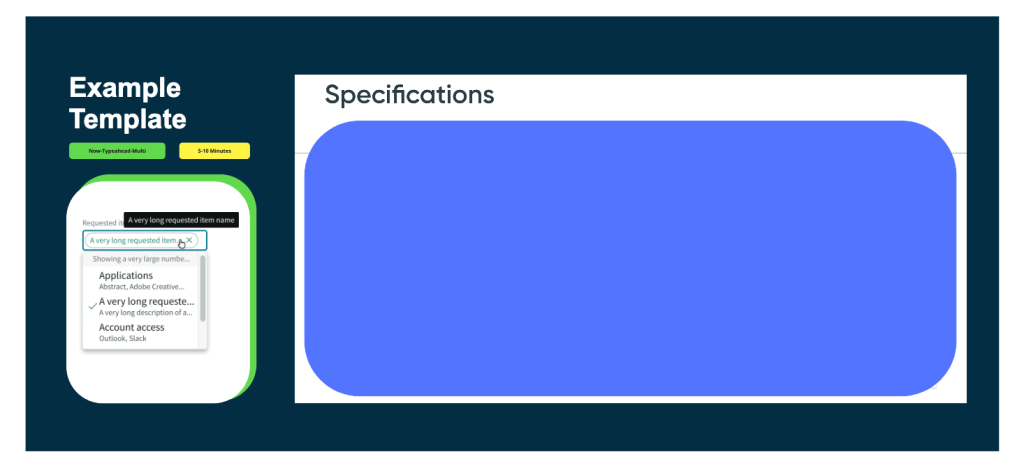
At the top of the workshop, participants were asked to review the existing accessibility specifications for a Now Design System component together. Now-typeahead-multi was chosen because it is there are a great array of complex interactions contained within a single component, including input fields, dropdown menus, pills, and multiple selected states. This initial review of a common artifact helped facilitate meaningful and collaborative reflection on what an ideal accessibility specification template should offer, and how ours could be improved to better serve our needs.
“Rose, Thorn, Bud” Exercise
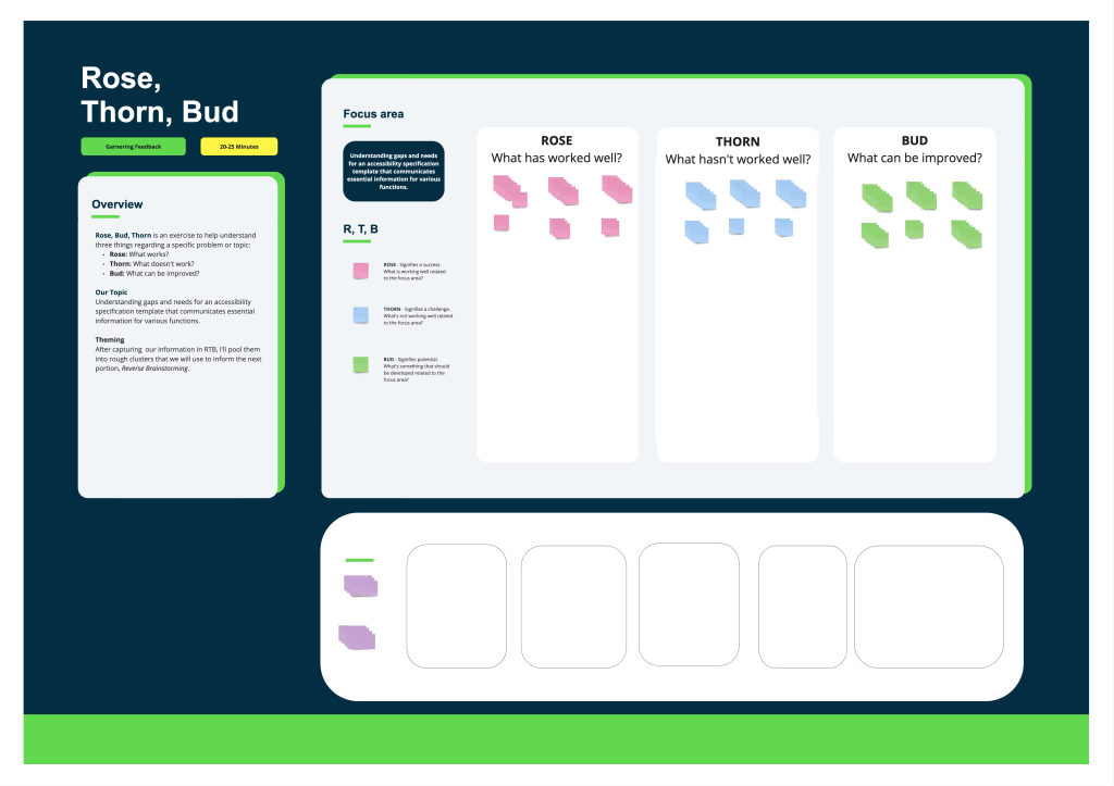
Next, we engaged in the Rose, Thorn, Bud exercise, a structured method to break down the accessibility template as it stood. The activity was comprised of three parts, with participants offered a few minutes to place their sticky notes for each exercise:
Rose: We highlighted elements that currently work well, acknowledging the strengths of our existing template.
Thorn: This step allowed us to candidly identify and discuss the shortcomings of the current template.
Bud: Finally, we brainstormed potential improvements, focusing on realistic and impactful changes.
This exercise was instrumental in uncovering the gaps and needs, and it was directly used to synthesize the guiding question for the subsequent brainstorming session, Reverse Brainstorming.
Reverse Brainstorming Exercise
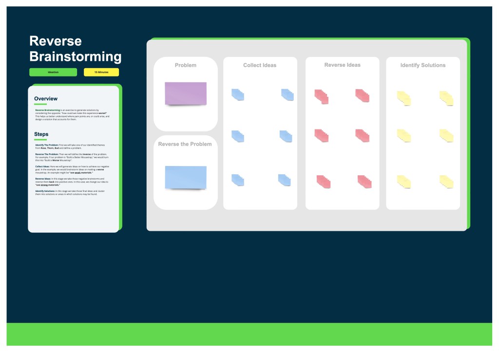
The Reverse Brainstorming portion of the workshop encouraged unconventional solution-finding, by asking participants to actively consider how to make a worse accessibility specification template, and featured the following structure:
Identify The Problem: We chose two themes from the Rose, Thorn, Bud exercise as our focal points.
Reverse The Problem: By flipping our challenges, we explored how we could exacerbate issues, to expose known pain points and anticipate potential pain points in a new accessibility specification template.
Collect Ideas: Participants brainstormed ways to ‘worsen’ the situation, leading to a rich discussion on the root causes of our challenges.
Reverse Ideas: We then flipped these ideas into positive solutions, transforming potential negatives into opportunities for improvement.
Identify Solutions: These ideas were clustered into actionable solutions, setting the foundation for our template redesign.
The following two problem statements developed from the themes in Rose, Thorn, Bud:
Problem Statement 1: How might we design an accessibility specification template that presents information in a logical way?
Inverse Problem Statement 1: How might we design an accessibility specification template that presents information in an illogical or unhelpful way?
Problem Statement 2: How might we make an accessibility specification template that has the content I need to do my job?
Inverse Problem Statement 2: How might we make an accessibility specification template that doesn’t have the content I need to do my job?
Findings
Broad Themes
Layout
Participants highlighted the template’s structural organization, emphasizing the need for a logical flow of information that mirrors the design and development process. Positive aspects included the use of clear labeling and visual differentiation of component elements, which aided in navigation and comprehension. Challenges were identified in the scalability of layouts for larger components and the intuitive linking between annotations and their corresponding elements, suggesting a need for a more flexible and user-friendly structure.
Content
The adequacy and relevance of information provided within the template were central to this theme. Strengths were found in sections that directly supported accessibility compliance, such as those detailing screen reader outputs and ARIA attributes. However, gaps were noted in coverage of essential accessibility considerations, leading to calls for more comprehensive content that spans a wider array of accessibility needs and specifications.
Designing with the Template
Feedback on this theme focused on the practical experience of using the template to design accessible components. Positive responses were given to tools and features that expedited the specification process, such as the EO Figma plugin. Nevertheless, there was a consensus on the necessity for enhanced annotations and/or design tools to streamline the creation of accessibility specifications further.
Testing and Validation
This theme captured insights related to the efficacy of the template in facilitating the testing and validation of accessibility features. While the template provided basic documentation of accessibility design, it lacked clear guidelines for practically testing designs.
Actionable Improvements
Feedback gathered from the workshop illuminated critical insights into the existing accessibility specification template’s efficacy.
Guidance or Guardrails Needed
Participants identified a need for a template that not only presented information in a logical and structured manner but also encompassed all the essential content required for thorough accessibility specification. Designers in particular expressed a lack of accessibility guidance as a pain point as they do not always have the accessibility domain knowledge to understand what accessibility information is necessary to include in their designs, illustrated by the following pieces of feedback:
“It seems like there should be more links to WCAG guidelines throughout, or a best-practices deck, or contact person to ask additional questions about specifics.”
“(After completing specifications for a component) still may not know what is the correct approach for a11y.”
Standardized ARIA Documentation
Another key finding was the template’s lack of clarity and structure, which hindered the efficient location and application of necessary information. This was particularly evident in how the template managed complex accessibility requirements, such as screen reader outputs, ARIA attributes, and keyboard navigation specifications. There was little existing guidance and structure for documenting complex interactions or features that required a combination of keyboard interactions and ARIA attributes to be properly accessible. The absence of comprehensive sections covering all critical accessibility considerations emerged as a significant gap. Participants expressed the need for a more holistic approach that would include detailed guidance on specifying various accessibility features.
Layout Improvements
Additionally, the findings revealed a need for easier access to accessibility and sub-component reference materials within the template, laid out in a logical way. There needed to be closer proximity between textual information and the visuals. A participant noted that the inclusion of such materials could greatly assist in the design process by reducing “eye gymnastics”.
“The ordering of the (existing forced colors annotations) bubbles was confusing and resulted in a lot of eye gymnastics.”
As a visual person, I tend to look at the visuals first then find the associated text. It was challenging to do that. The layout seems to assume I will read first.
Template Design Improvements
The Accessibility Specification Template was overhauled with the following sections:
- Shared Components: An area to document and link to any subcomponents, to reduce duplicate work and ensure consistency across documentation.
- Keyboard: An expanded Keyboard section offers multiple layouts to more concisely capture keyboard interactions for components.
- Alternative Text and Accessible Names: This section allows designers to communicate the unique names for components, or the logic behind generating unique, accessible names for components.
- Semantics and ARIA Markup: Here we capture ARIA markup used to communicate component states to assistive technologies, such as with expanded content, selected content, disabled content, and others.
- Live Regions and Alerts: These are sections that communicate status updates and alerts in a timely manner.
- Complex Interactions: This section is open-ended and meant to be a workspace to communicate interactions with complex interplay between keyboard interactions, ARIA markup, and changes to component states. An example includes a keyboard accessible alternative to drag-and-drop.
- Invisible Controls: In cases where controls are invisible by default, and revealed when hovering or focusing within a specific target area, the section captures the target area and the invisible controls contained within.
- Forced Colors: Forced Colors is a feature that allows high contrast or custom user contrast themes to render appropriately when active. When manual definition of forced colors is necessary (often the case with custom-built components), this section captures the needed forced color definitions.
Within those sections, the following areas offer guidance to people drafting documentation for their components:
- Overview: A brief description of the accessibility functionality being documented.
- How to Use: Guided instructions on completing the section, along with callouts to consult with an accessibility designer for assistance and validation.
- Available Assets (if relevant): Tools and annotation assets that are relevant for the section.
- Artifact: A space to show a component along with any relevant annotations.
Greater Guidance and Clarity
Expanded Keyboard, Accessible Names, and Semantics Sections
Detailed documentation of keyboard interactions and ARIA markup requirements in tandem promote accessible experiences for screen reader users.
The new template also provides specific guidance for documenting live regions, alerts, and complex interactions, offering teams the knowledge to more comprehensively design accessible user experiences. This attention to detail ensures that dynamic content and important notifications are accessible to all users, including those relying on assistive technologies.
Standardized ARIA Documentation
The new template features a dedicated ARIA section. This allows for the detailed description of required ARIA markup for various component states and interactions, ensuring that screen reader users receive accurate and useful information about each element’s role, state, and value when required. Sections dedicated to keyboard interactions, alternative text, and accessible names work in tandem with the ARIA section to guide authors in specifying components that are fully accessible. While dedicated accessibility design support may still be required to refine a design, all parties will have a better sense of what documentation is necessary for accessibility.
Layout Improvements
Various changes were made to the existing sections to be more useful as a reference. Specifically, the Keyboard section offers multiple layouts, horizontal, and vertical, to make documentation flow more naturally and reduce visual scanning. Also, the Forced Colors section was changed from a number-based system to a pointer and label system, greatly reducing the “eye gymnastics” for this section.
Release and Impact
Following the introduction of the updated Accessibility Specification Template, there have been positive changes to the overall design process at ServiceNow. The template has offered designers a more guided approach to integrating accessibility considerations into their work. While there’s always room for improvement, the structured template has lifted some of the burden of ensuring designs are accessible from the start.
The template has improved dialogue between product designers and the accessibility design team. With expectations around accessibility documentation set in advance, conversations are more focused, helping us address accessibility concerns more efficiently.
Incorporating the template into the master file in Figma was also a step towards making these resources more accessible to all our teams. Centralized access to the tool offers easier access, but also to encourage its use beyond the immediate Now Design System team. The hope is that over time, this influences a more uniform approach to accessibility across our various projects.
Reflections & Looking Ahead
Standardizing the documentation of accessibility patterns across our user experiences would be highly beneficials. While the template has helped guide designers toward more accessible designs, there exists a broader need for a cohesive set of accessibility guidelines for larger, repeated patterns. Offering standardized and modular templates for these patterns would not only make the design process more straightforward but also ensure that all users receive a consistently accessible experience, especially since ServiceNow’s products largely leverage patterns and customizable flows to enable workflows specific to client company needs.
As with everything in accessibility, it is paramount to engage with the disability community, especially those in tech or tech-enabled roles. Their firsthand insights are invaluable for uncovering specific needs and challenges as disabled designers, developers, or testers, that may not be immediately obvious to those without similar experiences. I see a great opportunity to enrich my understanding and improve products by seeking and incorporating feedback from this community. Working on accessibility is more about listening and learning from the people directly impacted, than it is about designing and developing to solve a technical problem.
 Omar Bonilla